 According to a survey, more than 90% of shoppers do not complete a transaction because the information provided is either inadequate or erroneous.
In e-commerce, the only way your customers can feel the merchandise is through your product detail page, as they are unable to assess the product physically. Building e-commerce product pages with high conversion rates is crucial to operating a profitable online business.
Despite its significant impact on conversions, many e-commerce firms struggle with appropriate product description page design.
This article give you a breakdown of the
What Is a Product Detail Page (PDP)?
A product detail page (PDP) is the digital gateway between an online shopper and a specific product. It is a dedicated webpage that provides comprehensive information about a product, offering potential buyers an in-depth understanding of its features, specifications, and benefits.
Essentially, the PDP serves as the virtual storefront, replicating the traditional brick-and-mortar shopping experience in the online storefront. The PDP is designed to showcase a single product, ensuring that users have all the necessary information to make an informed purchasing decision.
It’s a critical component of the online shopping experience, playing a pivotal role in shaping user perceptions, building trust, and ultimately driving conversions. Its effectiveness lies in presenting information in a user-friendly and compelling manner, ensuring that customers feel confident and satisfied with their purchase decisions.
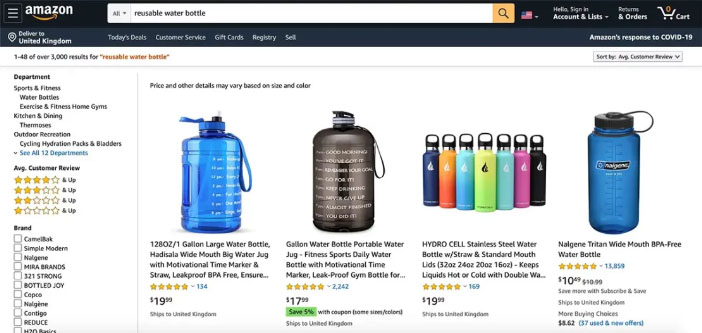
(Image courtesy of Amazon)
For instance, consider Amazon. You’ll notice that you’re presented with a list of options when you first search for a product on Amazon. If you discover the one you like, you can click on it to view additional details on a new page.
This page provides you with all the information you need to know about that particular item, including a description, measurements, supplies, and installation instructions. This is the product detail page.
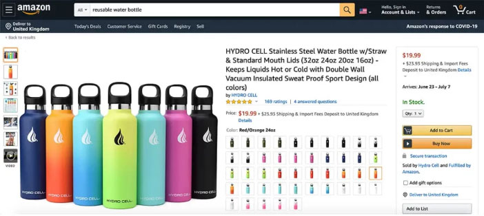
(Image courtesy of Amazon)
This page often includes a number of images of the product along with a list of the sizes and colors that are available. Lastly, it will have an add to cart button someplace close to it.
Why Are PDPs Important?
PDPs are important as customers hesitate to purchase products with inaccurate or inadequate product information. The success of a sale is significantly impacted by the caliber of your PDP.
They help boost brand trust as they demonstrate your commitment to your customer’s satisfaction and faith in your product by taking the time to assist them in making an informed purchase decision.
When information is precise and the buying process is simple, you may create positive customer experiences that may result in future sales. According to a survey, over 56% of US customers prefer to purchase online.
This indicates that more than half of your customers have prior e-commerce experience, therefore you stand a much better chance of gaining new customers if your website can close the gaps left by those of your rivals.
One of the best methods to prevent returns, abandoned carts, and unhappy customers is to have a well-designed product detail page. This is partly because easy-to-find product details significantly minimize the likelihood of purchasing blunders. This is only achievable, if you make sure that all product photos, pricing, and details are 100% true.
Difference Between Product Detail Page and Product Landing Page
There are two key players that drive sales in an e-commerce store — product detail pages (PDPs) and product landing pages (PLPs). Though both showcase products, their objectives and approaches differ significantly. Understanding these differences is crucial for crafting effective strategies that cater to each stage of the buyer’s journey.
| Difference Between a Product Detail Page and a Product Landing Page | ||
| No. | Product Detail Page | Product Landing Page |
| 1 | Purpose: Informs and convinces visitors about a specific product, aiming for conversion (purchase, add to cart). | Purpose: Introduces a product within a specific campaign or promotion, capturing leads or directing users to the PDP. |
| 2 | Target Audience: Shoppers actively research and compare products, closer to making a purchase decision. | Target Audience: Users at the awareness or consideration stage, potentially interested in a product category or offer. |
| 3 | Content: Deep dives into product features, benefits, specifications, technical details, and reviews. | Content: Highlights key features, value proposition, promotional offer, and call to action (CTA). |
| 4 | Design: Focuses on product visuals, detailed information, and user experience for product evaluation. | Design: Employs compelling visuals, concise content, and strategic CTAs to drive action. |
| 5 | SEO: Targets specific long-tail keywords related to the product itself. | SEO: Typically optimizes for campaign-specific keywords and broader product category terms. |
| 6 | Example: An individual product page on an e-commerce website. | Example: A dedicated page for a seasonal sale, new product launch, or product category. |
Key Components of an Effective PDP
Serving as the digital gateway between products and potential customers, a well-structured PDP can be a game-changer in influencing purchasing decisions. Mastering the below key components not only attracts potential customers but also converts them into satisfied buyers, paving the way for sustained success in the world of e-commerce.
1. High-Quality Product Images
At the forefront of a successful PDP is the inclusion of high-quality product images. Remember, a picture is worth a thousand words, especially when it comes to online shopping.
Clear, crisp, and multiple images from various angles provide potential buyers with a virtual hands-on experience, allowing them to inspect the product thoroughly before making a purchase.
Consider lifestyle photography that depicts the product seamlessly integrated into everyday life. Implementing features like zoom and 360° views for intricate details, and user-generated content (UGC) enhances the user’s engagement and builds trust.
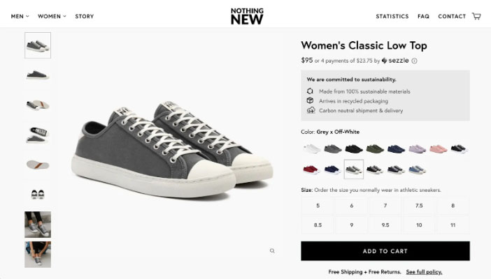
(Image courtesy Nothing New)
2. Menu
For clients to be able to navigate your website, the menu is a necessary navigational aid. Quick access to the homepage, different product categories, and the customer’s shopping basket will all be available from the menu.
3. Search Bar
A search bar is typically placed inside the navigation menu and is important as it makes it easier and faster for users to find what they’re looking for. The extra convenience and autonomy help in enhancing the user experience and can even increase revenue.
4. Breadcrumb
A breadcrumb indicates the route a user followed to reach the product page. The user’s travel and current position are displayed via breadcrumb navigation. Clickable links in the form of a breadcrumb menu or trail typically display at the top of the user’s current page in a horizontal line.
It simultaneously offers a distinct visual depiction of the structure and orientation of the website. The breadcrumb trail allows users to easily navigate from a particular page to different parent pages.
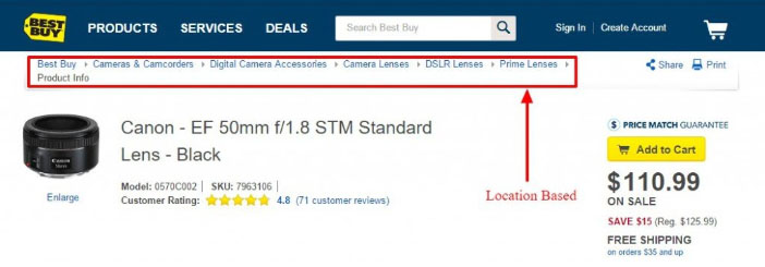
(Image courtesy Best Buy)
5. Clear and Concise Product Information
A well-crafted product description is the bridge between a potential customer and the product’s value proposition. Beyond listing specifications, a compelling product description tells a story.
Your PDP’s description should be a captivating narrative, highlighting the product’s unique features, dimensions, materials, color options, benefits, and potential uses, in a way that appeals to the customer’s emotions and needs.
Don’t forget clear pricing, including taxes and shipping costs, to avoid surprises later. Be transparent about availability and potential delivery times.
By striking the right balance between creativity and informativeness, businesses can create a narrative that resonates with their target audience. Keep in mind that you’re competing for attention, so make your content scannable with bullet points, bolding, and short paragraphs.
6. Call-to-Action (CTA) Buttons
A strategically placed and visually appealing call-to-action button is instrumental in guiding users towards the next steps. Whether it’s “Add to Cart ”, “Buy Now”, “Pre-Order”, or “Learn More”, the CTA button should be easily noticeable and encourage seamless navigation. The language used in the CTA should be persuasive and instill a sense of urgency without being pushy.
7. Advanced Optimization Techniques
Personalize your page by using the browsing history to recommend related products, offer relevant upsells, and tailor content to individual preferences. Interactive elements like Q&A sections, live chat support, and virtual try-on features further engage users and address their concerns. Ensure fast loading times, user-friendly navigation, and intuitive design for the ever-growing mobile audience.
8. Data-Driven Decisions
Utilize analytics tools to track key performance indicators (KPIs) like conversion rates, bounce rates, and time spent on page. A/B testing different content, visuals, and layouts allows you to identify what resonates best with your audience. Continuously refine and optimize your PDP based on data and user feedback to achieve peak performance.
Best Practices to Optimize PDP
1. Customer Reviews and Ratings
When you are in a market which aims at conversion rate optimization (CRO), you need to focus on turning more of your existing traffic into sales, improve your return on ad spend (ROAS) and increase customer acquisition.
Harnessing useful CRO tools such as the power of social proof (like industry awards and trust badges), customer reviews, testimonials and ratings, help you build credibility and authenticity. According to 48% of the customers, trust badges provide reassurance that the website is reliable and secure.
Hearing great reviews from previous buyers is the best way to persuade a potential buyer to buy a product. A transparent approach to customer reviews, along with timely responses to queries or concerns, creates a sense of reliability, influencing purchase decisions positively.
2. Related Products and Upselling Opportunities
Enhancing the PDP experience involves suggesting complementary or upgraded products. AI-powered personalization and strategic placement or upselling opportunities can help e-commerce brands recommend products that are similar or in the same general category as the customer is currently viewing. This can potentially increase the average order value (AOV).
Tip: Depending on whether you’re recommending an upsell or an add-on, recommendations can go anywhere on the product detail page. They are typically shown in a sidebar or at the bottom of the page.
3. Scarcity and Urgency Signals
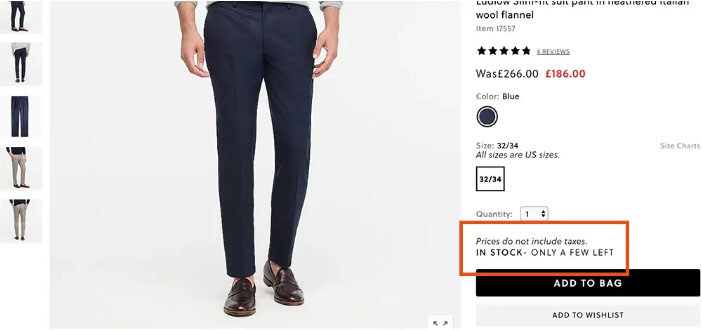
By showcasing a product being low in stock, using countdown timers, or with numerous people seeing it at once, you can effectively let your customer know that they might miss out on a product and that they must act quickly if they want to purchase it.
4. Return Policies
Offering satisfaction guarantees is a good strategy to address the perceived risks that your consumers may have.
Including this information on the PDP eliminates surprises during the checkout process and fosters a sense of security. Customers will feel more at ease purchasing from you if you have a return policy in place, in case they ever need to return something.
A disclaimer on terms of use and privacy policy could also be useful. This keeps you out of legal trouble in the event that a product is shipped wrong or malfunctions. List all guarantees and warranties, like money-back guarantees, best price guarantee, lifetime guarantee, free trial guarantee, or free sample guarantee, well.
The most common place for e-commerce stores to publish their return policy is in the footer of their website, so consumers can access it at any time while navigating through the site. You may also want to display it somewhere during the checkout process before the customer finalizes the sale, allowing them to read the procedure beforehand.
5. Shipping Information
As customers anticipate reliable, on-time deliveries as well as ongoing updates on the progress of their orders, transparency regarding shipping costs, and delivery times is crucial for building customer trust. You may also include any custom charges for international customers, if the product is being shipped to a different country.
For instance, if your business is in the US and you are shipping the product to your international customer, you need to inform them about the custom fees, duties, and taxes that will be charged on the value of the product.
Product description pages allow customers to assess a product and feel more secure about their purchase decisions, making them essential revenue-generating tools. When you combine comprehensive product details with enjoyable user experiences, customers are more inclined to choose your business over your competitor.


